UPDATE!!! INSERTS ARE AVAILABLE FOR DOWNLOAD IN BOTH FRANKLIN COVEY (6.75 X 4.25) COMPACT SIZE AND FILOFAX (6.75 X 3.75) PERSONAL SIZE. Scroll down!
As an FYI they look distorted when viewing them but are perfectly fine once downloaded :-)
Hi friends,
I am back with an update on my Filofax Personal Windsor. In my last video I had addressed my issue with not being able to find inserts I actually like in terms of design and /or layout. I did find the Serenity Pack from Franklin Covey and liked the layout, but not the design. Another concern with using Franklin Covey Compact size inserts in a Personal size Filofax is the paper size itself: 4.25 x 6.75 instead of 3.75 x 6.75. So basically, FC inserts will hang over to the side. Some Filofax lovers may find it annoying, I personally do not care since I need more writing space.
So I said I was going to start making my own inserts and this weekend I was busy mulling around the idea until I finally sat down at the PC and plugged away with Microsoft Publisher.
I used Publisher to make my inserts because it allows you to take full advantage of grids and guidelines. It also aligns elements for you or at least shows you where the proper alignment is. I did not find a similar feature in any other Office software. If you do not have Publisher, do not worry, all my inserts are downloadable as PDFs anyway.
I will make other inserts (to-do's , finance etc.) but for now I just wanted to play around with the FC layout and One Week on Two Pages.
Here is a sample FC in Serenity (compact size):
I like the layout a lot, in particular the fact that appointments stay at the top and most of the space is taken by unlabeled boxes. On the negative side, and having used this set up for the entire month of June, I found that the appointment boxes were too small and that the last set of boxes at the bottom of each page, were not usable, therefore a waste of space. As mentioned in my previous video, I also had difficulty reading the days of the week on top as they are printed tone - on - tone and in super tiny script.
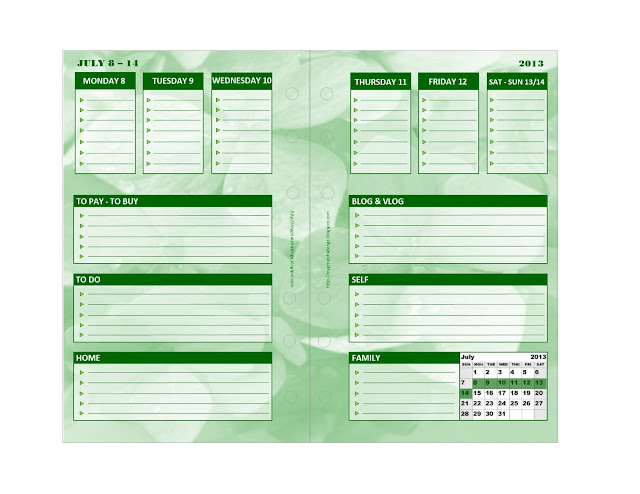
With that in mind, I recreated my own version of the layout, with a twist and below is my first week for July 2013:
As you can see, days of the week are clearly labeled. I also extended the size of the appointment boxes and inserted my own labels for the goal boxes, as per my own needs (To Pay - To Buy, To Do, Home, Blog and Vlog, Self and Family). These are the labels I have been using and find to help me most with organizing my week.
I also added a tiny July calendar at the bottom and highlighted the corresponding week.
So of course I got carried away and decided to do the entire month of July 2013 just to see how difficult it would be to change colors (not design) in Publisher and that was relatively easy. So here are the other 4 weeks:
On the last week, since there were only three days left, I moved the right page layout up a bit and added the calendar for August as well as a box for notes. There was some empty space left and so I inserted a quote by Former British Prime Minister, Margaret Thatcher:
Any woman who understands the problems of running a home will be nearer to understanding the problems of running a country.
All these inserts are available for download below.
In the meantime, and until we get to August, there are a few things I need to work on:
1. Figuring out a way to print double sided in order to save paper.
2. Find the right quality paper to minimize bleed.
3. Better design (not layout) for the following months since this was only a tryout.
4. Finance sheet and other inserts.
Here is the video so that you can see them in ACTION!
I would love to hear your feedback in particular, since this is a Franklin Covey size for Compact (Personal) planners, would you like to see the same layout in different sizes (Filofax Personal and A5) - I would not mind resizing so that everyone would benefit from my free downloads!
What kind of labels would you like? Would you rather have blank spaces so that you can insert your own labels by hand?
If you have any request and/or question...use the comment box below.
Here are the links for downloads:
FRANKLIN COVEY OOMPACT SIZE
July 2013 - Week 1
July 2013 - Week 2
July 2013 - Week 3
July 2013 - Week 4
July 2014 - Week 5
By popular request here are the FILOFAX PERSONAL SIZE inserts (because I completed them on 7/2, I am making week 2,3, 4 and 5 available)
FF July 2013 - Week 2
FF July 2013 - Week 3
FF July 2013 - Week 4
FF July 2013 - Week 5
I hope you enjoy them.
Thank you for liking and sharing my post.
Sophia, NJ
You can find me on FACEBOOK and YOUTUBE
*This site and post contains affiliate advertising. I am not affiliated with Filofax, Franklin Covey or Microsoft Office. All opinions are my own.
As an FYI they look distorted when viewing them but are perfectly fine once downloaded :-)
Hi friends,
I am back with an update on my Filofax Personal Windsor. In my last video I had addressed my issue with not being able to find inserts I actually like in terms of design and /or layout. I did find the Serenity Pack from Franklin Covey and liked the layout, but not the design. Another concern with using Franklin Covey Compact size inserts in a Personal size Filofax is the paper size itself: 4.25 x 6.75 instead of 3.75 x 6.75. So basically, FC inserts will hang over to the side. Some Filofax lovers may find it annoying, I personally do not care since I need more writing space.
So I said I was going to start making my own inserts and this weekend I was busy mulling around the idea until I finally sat down at the PC and plugged away with Microsoft Publisher.
I used Publisher to make my inserts because it allows you to take full advantage of grids and guidelines. It also aligns elements for you or at least shows you where the proper alignment is. I did not find a similar feature in any other Office software. If you do not have Publisher, do not worry, all my inserts are downloadable as PDFs anyway.
I will make other inserts (to-do's , finance etc.) but for now I just wanted to play around with the FC layout and One Week on Two Pages.
Here is a sample FC in Serenity (compact size):
 |
| Image Source |
I like the layout a lot, in particular the fact that appointments stay at the top and most of the space is taken by unlabeled boxes. On the negative side, and having used this set up for the entire month of June, I found that the appointment boxes were too small and that the last set of boxes at the bottom of each page, were not usable, therefore a waste of space. As mentioned in my previous video, I also had difficulty reading the days of the week on top as they are printed tone - on - tone and in super tiny script.
With that in mind, I recreated my own version of the layout, with a twist and below is my first week for July 2013:
As you can see, days of the week are clearly labeled. I also extended the size of the appointment boxes and inserted my own labels for the goal boxes, as per my own needs (To Pay - To Buy, To Do, Home, Blog and Vlog, Self and Family). These are the labels I have been using and find to help me most with organizing my week.
I also added a tiny July calendar at the bottom and highlighted the corresponding week.
So of course I got carried away and decided to do the entire month of July 2013 just to see how difficult it would be to change colors (not design) in Publisher and that was relatively easy. So here are the other 4 weeks:
 |
| Week 3 |
 |
| Week 4 And week 5 below. |
Any woman who understands the problems of running a home will be nearer to understanding the problems of running a country.
All these inserts are available for download below.
In the meantime, and until we get to August, there are a few things I need to work on:
1. Figuring out a way to print double sided in order to save paper.
2. Find the right quality paper to minimize bleed.
3. Better design (not layout) for the following months since this was only a tryout.
4. Finance sheet and other inserts.
Here is the video so that you can see them in ACTION!
I would love to hear your feedback in particular, since this is a Franklin Covey size for Compact (Personal) planners, would you like to see the same layout in different sizes (Filofax Personal and A5) - I would not mind resizing so that everyone would benefit from my free downloads!
What kind of labels would you like? Would you rather have blank spaces so that you can insert your own labels by hand?
If you have any request and/or question...use the comment box below.
Here are the links for downloads:
FRANKLIN COVEY OOMPACT SIZE
July 2013 - Week 1
July 2013 - Week 2
July 2013 - Week 3
July 2013 - Week 4
July 2014 - Week 5
By popular request here are the FILOFAX PERSONAL SIZE inserts (because I completed them on 7/2, I am making week 2,3, 4 and 5 available)
FF July 2013 - Week 2
FF July 2013 - Week 3
FF July 2013 - Week 4
FF July 2013 - Week 5
I hope you enjoy them.
Thank you for liking and sharing my post.
Sophia, NJ
You can find me on FACEBOOK and YOUTUBE
*This site and post contains affiliate advertising. I am not affiliated with Filofax, Franklin Covey or Microsoft Office. All opinions are my own.


